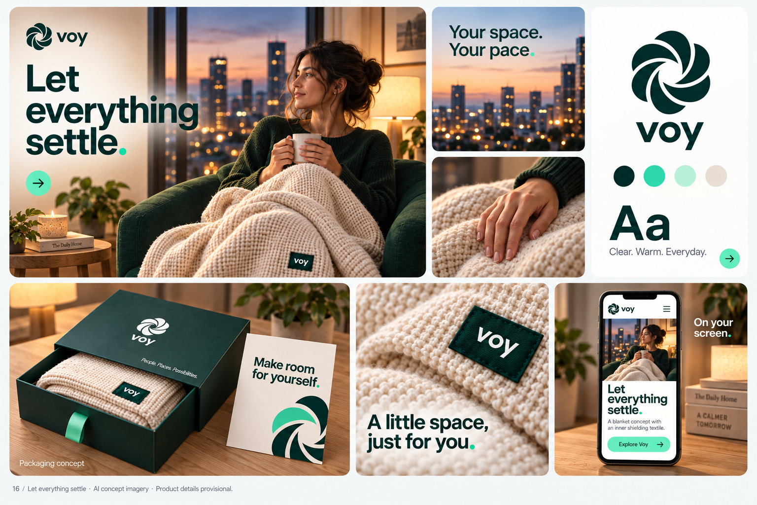
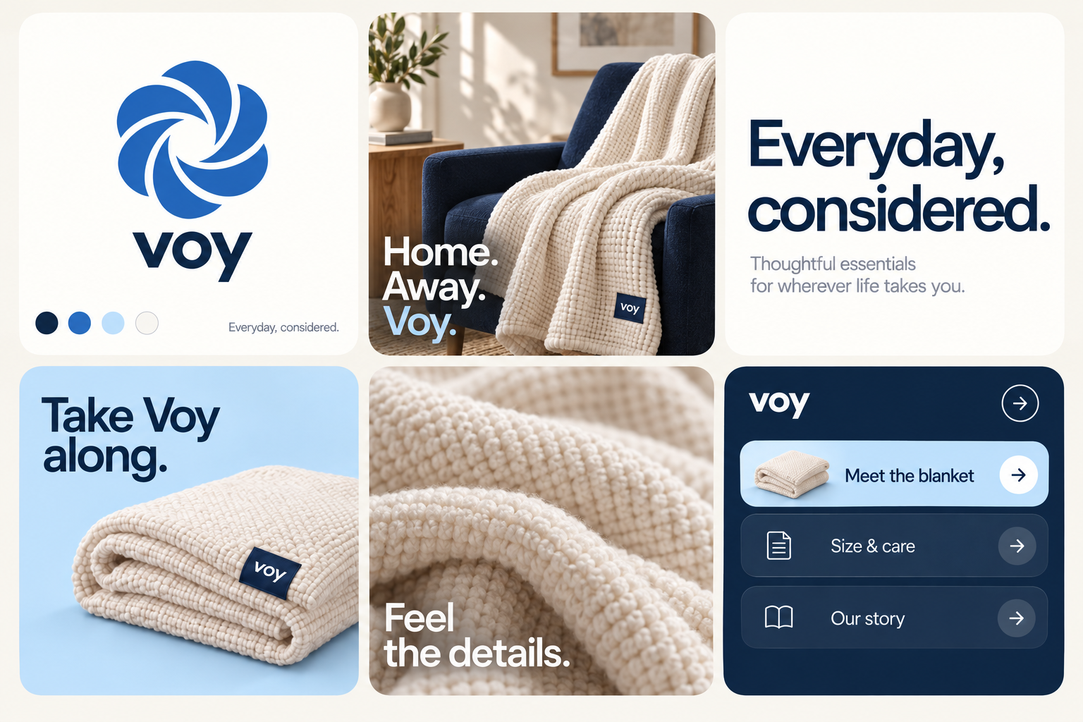
1) Brand Board
Identity
A design-led showcase of the Voy identity: logo, palette, typography, art direction, and brand applications.
Focus
The emphasis is visual craft and a consistent aesthetic across every touchpoint.
A design-led showcase of the Voy identity: logo, palette, typography, art direction, and brand applications.
The emphasis is visual craft and a consistent aesthetic across every touchpoint.
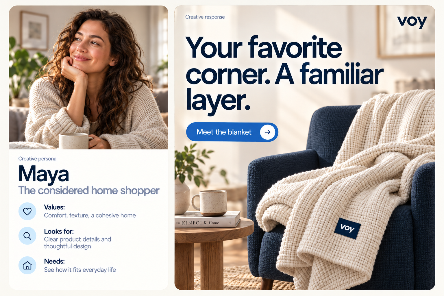
The working creative audience values a considered home and wants everyday products to feel as good as they look.
Product texture, clear information, and a calm presentation guide this direction.
This persona is a creative starting point, not a research finding.
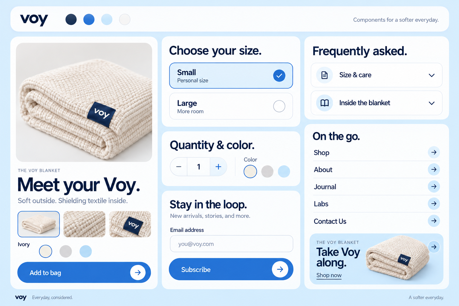
Carry the identity into actions, product cards, navigation, and information panels.
Product cards, selection states, forms, FAQs, and mobile navigation share the same type scale, spacing, rounded surfaces, and blue actions.
Use a strong product image, clear hierarchy, and deliberate whitespace to introduce the brand and lead into the product story.
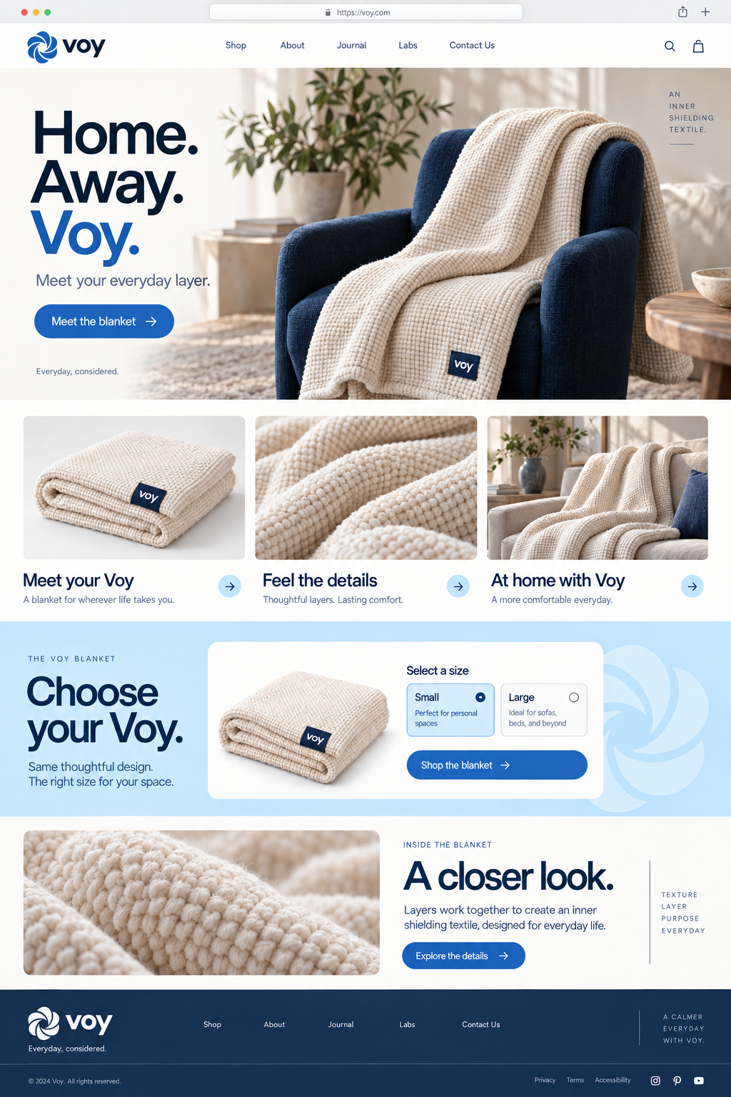
A complete desktop composition connects the hero, product collection, size selection, detail section, and footer.
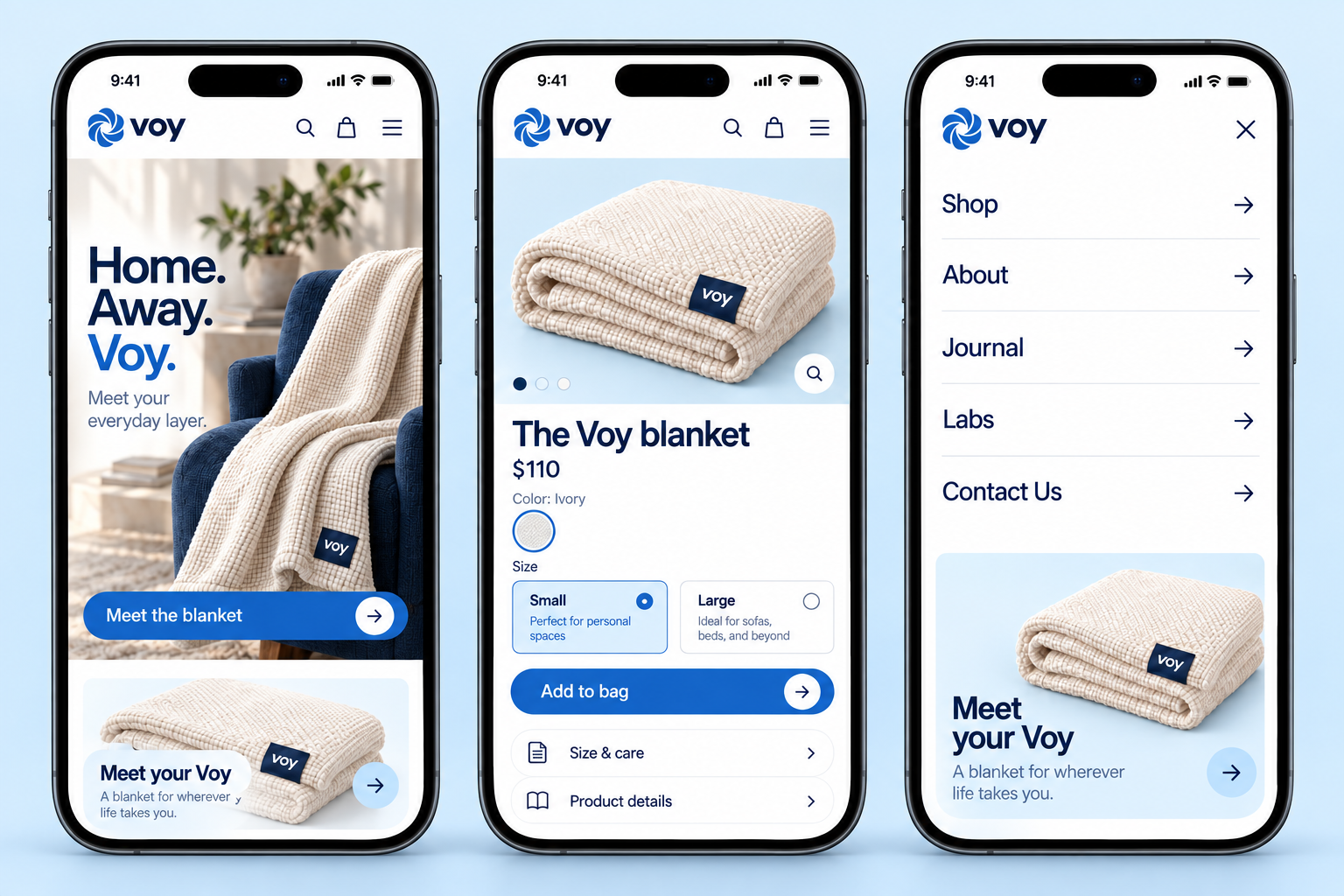
Bring the product, essential information, and next action into a focused mobile composition.
The homepage, product page, and five-link navigation use a mobile-specific hierarchy with prominent purchase actions.
Build one cohesive campaign for the design-conscious home shopper: an inviting product-in-room visual, a closer look at texture and detail, and a clear invitation to explore.
Keep the campaign and website visually connected.
These are creative concepts, not measured campaign results.